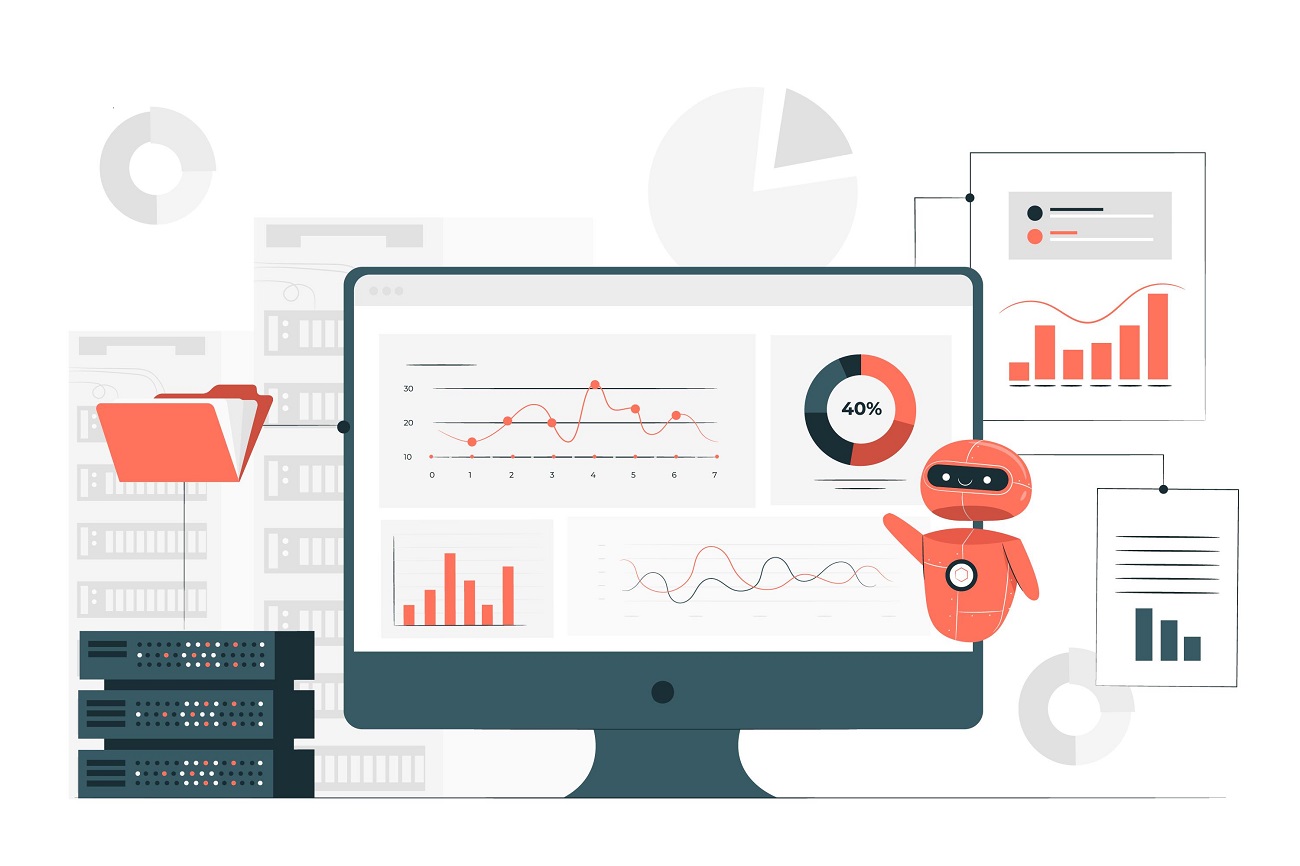
Building An Easy-To-Understand Data Analytics Dashboard Is Easier Said Than Done
Many organizations rely on an analytics dashboard to present real-time data in logical and clear formats that can be used as an executive summary or big picture.
Analytics dashboards have evolved over the decades, and now, the latest iteration is the interactive analytical dashboard.
With the advent of data analytics, for a business, visualizing the data and interacting on a single screen has become a necessity. What is an Analytics Dashboard and how to design one?
A good analytics dashboard must be able to communicate the required information to the user quickly and effectively. An oft-cited comparison is to that of a car dashboard which conveys driving speed, RPM, fuel limit, etc, in one glance to the driver; quick and efficient.
Dashboards need not be complicated at all. To know how to make easy-to-understand dashboards, get in touch with our experts.
But that would also be oversimplifying things. A car dashboard, at the very best, is an example of a static dashboard.
Data dashboards, on the other hand, have a lot riding on them and their design (often interactive) can tend to get complicated if adequate care is not taken from the very start.
Essentially, they collect and showcase information in a visual format. But it does not end there, for data dashboards are the starting point for business activity.
Because it can get complicated very quickly, a business needs to choose or develop the right dashboard. If not, there’s the danger of data loss or even of wrong interpretation of a data set, which could be disastrous for a business.
Data Dashboards Can Be Divided Into 3 Broad Classes
Operational Dashboard: This type of dashboard allows users to conduct data-driven actions.
Data is often updated here. An example of such an operational dashboard is a stock trading app.
Analytical Dashboard: This type of dashboard shows large volumes of data to help users interpret the information.
A very common example is Google Analytics. Analytics dashboards are used when large volumes of data are to be compiled and analyzed to help businesses get meaningful insights.
Strategic Dashboard: As the name suggests, a strategic dashboard is a reporting mechanism for tracking a company’s strategy for the long term.
This is one of the most complicated dashboards to develop. What it does is track your business’ performance against KPIs so that you can action can be better aligned with the overall strategy.
Enhance Your Business Efficiency with Our BI Experts
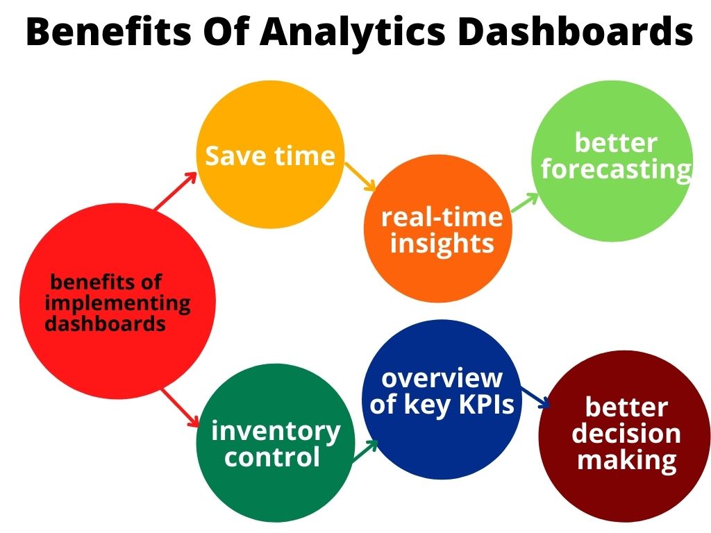
6 Benefits Of Analytics Dashboards
The function of any business intelligence dashboard is to extract value from the data collated, also known as key performance indicators (KPIs).
Here are some of the benefits of implementing dashboards in your business operations:
Save time
Before dashboards, there were cumbersome sheets and charts which took a lot of time to draw up. BI dashboards that replaced them save a lot of this time. Data is drawn from a centralized source and displayed for interpretation.
Real-time customer analytics
BI dashboards provide real-time insights on customers’ buying history and behaviors, which can, in turn, allow businesses to achieve higher retention rates and increased revenue.
Such insights allow the marketing and sales team to concentrate on the right customers at the right time.
Better forecasting
When a business has more insights into the buying cycle of customers, future demand can be better predicted.
BI dashboards can be used to plan more effectively for demand fluctuations in business cycles.
Inventory control
Because it helping in better forecasting based on a customer’s past buying history, dashboards can also help with managing inventory.
Sales staff can easily monitor which are the faster moving items, which of them are in stock, which need replenishment, and so on.
KPIs
Because of their very nature, dashboards provide an overview of key KPIs of various business aspects in the present time along with actionable insights.
Better decision making
Last but one of the most important benefits of a data analytics dashboard is helping businesses to analyze key datasets quickly, allowing business teams to make better decisions at the right time.
How to Design Analytics Dashboards
Many have faltered on the road to designing a BI dashboard.
The reason is simple: because of the complexities involved such as large volumes of data that may also change over time, designers do tend to get waylaid. And, let’s not forget the limited space available for the display.
In the design and development stage itself, you must remember that clarity, not complexity is of paramount importance here.
Or else, the exercise can become overwhelming for the end-user. If a designer does have too much data available, he should display only the most relevant dataset.
Designing a dashboard is a three-point plan: The first and foremost point to remember while designing a dashboard is: try and keep things simple.
The next feature is to use the dashboard to tell a story; obviously one in the context of data and business. Last but not least, the chosen data visualization must represent the data and the information you want to extract from it correctly.
Here are some of the other points to consider while designing an analytics dashboard:
- All information must be one click away as far as possible
- There must be a clear visual hierarchy on the screen in the way the information is displayed
- The dashboard must allow for filters to enable users to customize how every dataset is displayed
Guiding principles to BI dashboard design:
- What is the project goal?
- What is the nature of the data?
- What are the needs of users?
One tried and tested method of designing a BI dashboard is to copy the formula that journalists use to file a news report: the “Inverted Pyramid”.
It consists of the 5 Ws (What, Where, When, Who, and Why) and 1 H (how). As a news report does, the inverted pyramid dashboard should also display the most important facts or insights right on the top of the dashboard screen, and trail off to the least important or granular details at the bottom, in order of diminishing order.
Best Practices
BI dashboards have two things working (or not working) for them: data and design. Each is as important as the other.
You may have the healthiest of data inputs, but a poorly designed dashboard will fail to convey meaning, and even make the data less comprehensible.
The design thumb rule is: each dashboard must have not more than 5-9 visualizations. Use filters and hierarchies to avoid clutter.
Ensure your dashboard is not only clear in providing insights, but it is also customizable.
Here are some of the other points to bear in mind:
- Dashboards must be able to communicate insights quickly
- They must depict trends and changes in data over time
- They are customizable
What makes a good dashboard great is the way you choose the right type of data visualization.
Data visualization must not only be catchy but must serve a specific purpose and effectively convey the most important facts.
Here’s What Not To Do:
Do not try to answer ALL the questions in a single dashboard. Too much information can overwhelm the user.
- Do not take the control away from the end-user. Some data visualization elements create more work for a user, forcing them to spend long hours narrowing down on the data.
- Do not slapdash random colors or it may interfere with visibility and navigation. This is where the color palette comes into play.
- There should not be a randomness to the eye movement across the dashboard. Apply the F and Z reading pattern, and structure your page accordingly.
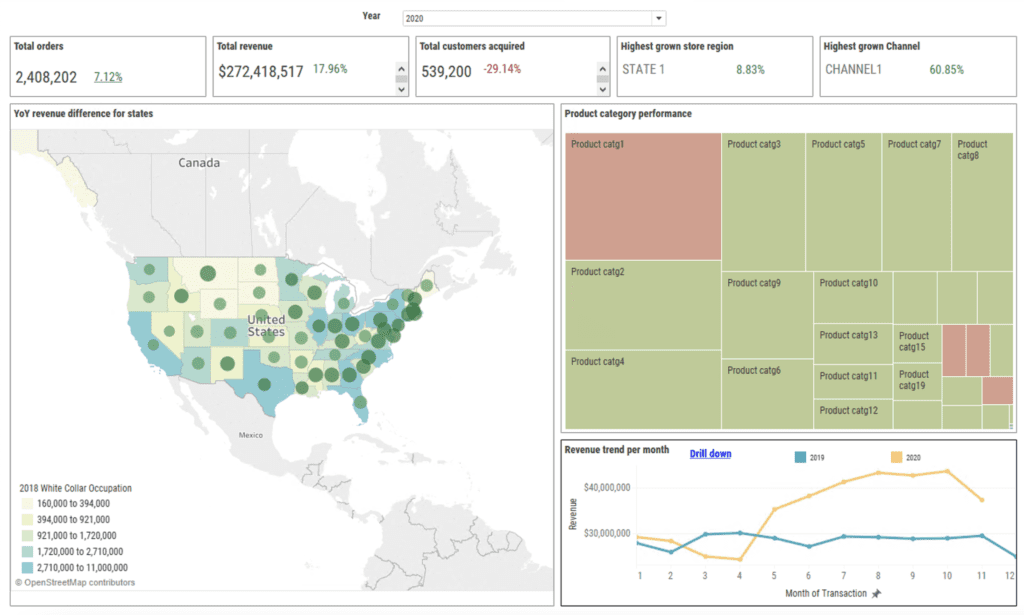
Now, the above is a practical example of dashboard design. This has been done using the Express Analytics customer data platform(CDP) Oyster.
The dashboard is a typical sales and marketing dashboard. It is divided into 5 main sections, and they are highlighted in the attached screen in different colors.
Blue – This is a year filter that applies to the entire dashboard. This is necessary as sales execs and marketers want to compare performance across selected years vs the last.
So, if 2020 is selected the information in the analytics dashboard shows 2020 to date data, and compares it to the 2019 year to date.
So, depending on the historical data present in Oyster, we can show this filter. By default, it is 3 years including the current year.
Pink – This section shows the KPIs in the form of tiles. Now, KPIs will change depending on the client and the type of analytics dashboard.
For example, a new company might be interested in new customer acquisition vs an established company looking at customer’s retained metrics.
Another example could be: a data analyst may want to see more titles related to the KPIs like estimated customer lifetime value, predictive model score summaries, etc., whereas a marketer might be interested in which campaigns gave higher ROI, which regions were underutilized, and so on.
All these KPIs are created in the backend depending on the available data and made available as per the audience.
Another thing to note is these metrics are benchmark metrics, meaning they compare year to date vs last year to date as shown in the percentage change.
Yellow – This section shows a map view of revenue (this year vs last).
Now there are two features to this: one is after looking at the state numbers you can click on that state or even select multiple states to drill down to another map which shows data at city and then at the zip code level.
The second feature is you can embed an external dataset in this analytics dashboard and overlay it on top of your sales data to derive insights.
Here, for example, we are using US census data (white-collar occupation) to see how your company is doing across segments, something that your company does not have.
Teal – This section helps keep a track of what is the buying behavior, what kind of products are being bought this year vs the last year.
The heatmap or treemap shows revenue in terms of color and number of orders in terms of size. You can click on the product category to deep dive into the product SKU level.
Green – This is a revenue trend line graph useful to find patterns across multiple years.
You can again drill down to look at trends at the day level and see how sales performed during sale events and after major campaigns.
In conclusion: Building Analytics dashboards have become a business necessity but designing a BI board should follow certain rules. Care must also be taken to ensure the board does not become complex. BI dashboards can be used to establish a relationship between two or more variables, or to compare two or more variables alongside, to name a few.
An Engine That Drives Customer Intelligence
Oyster is not just a customer data platform (CDP). It is the world’s first customer insights platform (CIP). Why? At its core is your customer. Oyster is a “data unifying software
Liked This Article?
Gain more insights, case studies, information on our product, customer data platform
No comments yet.