
The Many Routes From Data To Visualization
Data visualization makes it comparatively easy for the human brain to comprehend the information, but simultaneously, visualization also helps in detecting patterns and outliers in data sets.
The increasing dependence on data has made it imperative to translate information into visuals (graphs) for better and faster consumption.
The graphical depiction of data is a method of visual communication that helps to engage program stakeholders by increasing their capacity to understand data and participate in the assessment and decision process.
From static to interactive to time series data visualization, and from causal loop diagrams to system dynamics models, data visualization has seen rapid growth in the last decade or so.
That’s because of the availability of not only cost-effective technology but also faster computing.
Data visualization tools are growing in number because data analysis is no longer the sole purview of the IT cell or a team of data scientists.
Professionals from as disparate fields as health and tourism now are consumers of data and so need these visualization tools for their own analyses.
Visualized data gives all the stakeholders help conjure a better forecast of the future.
There are many different techniques of visualizing data, starting from the simple Excel sheet to a variety of different graphs and tables to pre-built dashboards.
The science has moved on from static to interactive to even a time-stamped form.
What is Data Visualization and How Does It Work?
Before getting into the details of the time-series visualization, here’s a quick explainer of data visualization and its works.
Visualization gives a clear “picture” of what the data analysis means by giving it a visual context.
Scientifically, a human brain is more equipped to process images better than words, so data visualization makes it easy for the human mind to identify patterns within large data sets.
Then, the visualization may be in the form of a map, a graph, a bar chart, or something more.
The objective here is to effectively communicate information to the target audience.
According to this research paper, the definition of data visualization relies on qualitative or quantitative data, results in an image that is representative of the raw data, while the result is readable by viewers and supports exploration, examination, and communication of the data.
For data visualization to happen, you need to take raw data, model it and deliver the data analysis so that conclusions can be reached.
Today, data analysts are also developing machine learning algorithms to better collate data for visualization purposes.
Want to Explore Our Business Intelligence and Analytics Services?
Time Series Data Visualization Types and Dashboards
Time series monitor trends over time, which is also one of the most valuable applications.
One needs all the important data from the past to forecast the future, and a time series visualization dashboard tells where your enterprise is and where it could potentially go.
From taking information from an Excel spreadsheet and turning that information into bars or graphs, data visualization has also come a long way from this static output.
The earlier static data visualization methods did not have any scope of interactivity, and hence they were unable to change with time.
These were used to tell a specific data store so they were best for less complex presentations. An example would be an infographic.
On the other hand, interactive data visualization helps change the graphical representations of data.
They can do this by using interactive tools that help to modify the parameters of data visualization, thus helping a user to do one or all of the following: see other details, create more insights, or even ask more questions about the presented data.
Unlike earlier years, today, open-source projects as well programming languages like JAVA have made interactive visualization more accessible.
Whether static, interactive, or time series, you need to think carefully about which type of visualization best suits your project before finalizing one. The arbitrary choice is of no help.
If time is a major factor, you need to deploy time-series data visualization. Here, you can map data points against intervals of time. Each point equals the time and quantity that have to be measured.
On an x-y graph, Y is used to plot an increase in time while the vertical axis has the values of the variable being measured. These charts are used to lock in on a trend or understand how a metric has changed over time.
What is Time Series Data Visualization?
First, there was static, then interactive data visualization. Then came along the time series visualization, often described as “the most accurate form of data visualization” so far.
It tracks data over time, thus giving you the ability to follow changes over a period and so generate forecasts, even.
Time series data visualization can be described as driving with one eye on the rearview mirror for it allows enterprises to analyze real-time as well as historical metrics.
If you are interested in knowing about dashboards and data visualizations, our experts’ team is on standby. Just fill in this short form.
Easy to create, a line graph is the simplest way to represent time series data. The graph uses points connected by lines to depict how a dependent variable and independent variable have changed.
An example would be the movement of the shares of X company over last month.
Other quick methods of depicting data include temporal visualizations. These are similar to one-dimensional linear visualizations.
The characteristics of temporal data are having items with a start and finish time.
Timeline visualizations usually have events before, after, and during a time period.
The tools for temporal visualizations include d3.js, from the developers of Provotis. It’s a free JavaScript library for manipulating documents based on data.
Some examples of temporal visualizations are: timelines, Gantt charts, arc diagrams, time series charts, and alluvial diagrams.
With the explosion in data, time-series visualization has gained importance in many sectors like finance, pharma, and even social media.
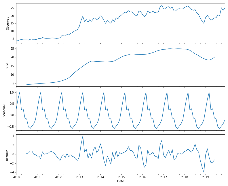
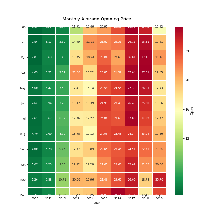
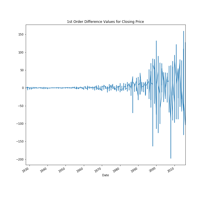
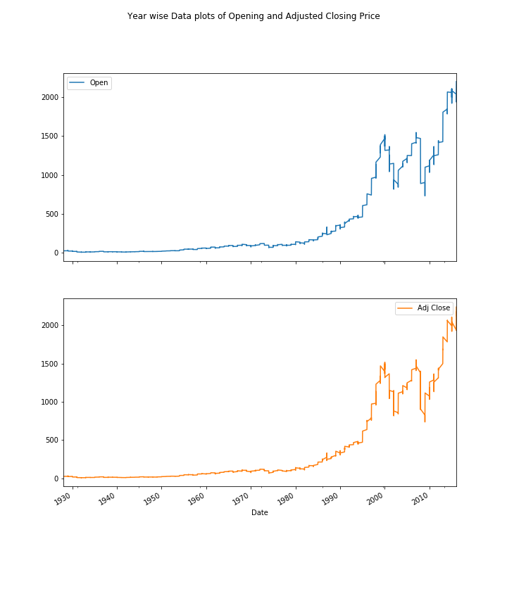
Express Analytics’ data scientist Anubhav Sarkar worked out in Python script these four plots using stock price data. The heatmap shows the monthly average “Opening Price” data, where darker red means very high opening prices and darker green means very low opening prices.
Why is Data Visualization Important in Machine Learning?
Data analysts can implement data visualization techniques in machine learning to focus on the bigger picture of the data at all steps.
Later, they can shift their focus to model design, model performance, and data meaning.
The importance of data visualization in machine learning can be understood by considering any of the algorithms used to produce such innovative programs. The machine learning algorithms can speed up the data discovery process.
How Does Machine Learning Help in Data Analysis?
When you assign machines tasks such as categorization, clustering, and anomaly detection – activities at the fundamental of data analysis – you are implementing machine learning.
You can create self-improving learning algorithms that consider data as input and provide statistical conclusions.
The algorithms make judgments whenever they notice a change in pattern without depending on hard-coded programming.
Before looking at particular problems associated with data analysis, you need to discuss a few terms used to classify various machine learning algorithm types.
Initially, you can notice the majority of algorithms are either regression-based, in which machines forecast values, or classification-based, in which machines sort information into classes.
Now, let’s differentiate between unsupervised and supervised algorithms.
The data used to train unsupervised ML algorithms doesn’t require an output variable to direct the learning process. Whereas, a supervised algorithm offers goal values following data training.
Even though these machine learning models are popular, you still need human intervention to obtain the conclusions of the data analysis.
Through advanced techniques and features, machine learning improves the process of data analysis in the below-mentioned ways:
Data cleaning is the most challenging step of analysis and consumes time.
Recognize fraudulent transactions
Machine learning is a complicated technology that thoroughly examines audience behavior data.
Enhance Your Business Efficiency with Our BI Professionals
How Does Data Visualization Use Machine Learning?
Machine learning visualization or ML visualization is the activity of representing data, ML models, and their interactions via pictorial means.
A methodical approach is used by machine learning to conduct data analysis. Whereas, the task is dependent on two major components such as data summarization, data mining, and data visualization.
Automated tools are mainly used to summarize the actual data structure and distribute it according to its attributes.
Data structure
Machine learning for data analysis uses data types and numbers to summarize the data. The objective is to make the data transformation process very simple.
Data Attributes
The attributes are distributed and summarized in such a way that eases the data preparation process.
The main elements that are included are that the real-value attributes are employed to produce a five-number summary.
Minimal accuracy is defined, and summarization is performed using the predictive model.
Later come the parametric and non-parametric methods that are employed to work on the correlation coefficient with the pairwise attribute correlations.
Visualize data
The information is compiled into a graph, where it is analyzed and captured to build a structure. These attributes will aid you in knowing the emergence of machine learning solutions for finance automation.
How are AI and ML Shaping Data Visualization?
Let’s see how AI and ML are shaping data visualization:
- Exploring unfamiliar or millions of datasets.
- Measuring data
- Identifying patterns according to the data gathered by the company
- Finding answers to well-formed queries; testing hypotheses
- Identifying unexpected behaviors
- Presenting analytical summaries to non-technical audiences
Why Do Businesses Need to Combine ML with BI Visualization Tools?
Integrated with ML, BI software helps business owners identify a layer of insight often missed by the most experienced professionals.
The benefits of ML algorithms for business intelligence reports post-integration are listed below:
Task automation
ML can manage day-to-day tasks, allowing both consultants and analysts to use their time more productively.
Self-service
New stages of self-service will be reached by business intelligence tool sets, minimizing the requirement of technical background and providing effortless methods of communicating with data.
An Engine That Drives Customer Intelligence
You can design great dashboards within the Express Analytics customer data platform Oyster. Get in touch to know how.
Liked This Article?
Gain more insights, case studies, information on our product, customer data platform